Gardens by the Bay Website
The Case Study


THE CHALLENGE
gardensbythebay.com.sg has seen increasing web traffic over the years and has a growing need for optimisation to cater for today’s users. Given the current COVID-19 situation, there was higher dependency on online touch-points.
WEBSITE GOAL
-
Refresh content layout and enhance website capabilities.
-
Enhance conversion with a seamless journey to discover and book your next visit to the Gardens.
-
Eventual increase in footfall and revenue from online streams.
WHAT I DID
Before embarking the redesign project, I orientated myself with all the past documents and research that was done before and combed through it, noting any questions as I went along.
REVIEWED PAST RESEARCH

STAKEHOLDER WORKSHOP
-
I started by reviewing past research materials and data audits (from DentsuX / Kantar / Tribal)
-
I then explored the profiles defined in the GBB brief, and incorporated what we heard and synthesised from GBB BUs
-
Considering the current landscape of 2020 and the effects of COVID, I focused on what can be done for the profiles
To identify stakeholder requirements and profile needs, as a team, we gathered inputs from business units across Gardens by the Bay. We spoke to 22 participants, sent out individual questionnaires for direct responses, conducted 3 workshop sessions and gathered over 300 data points

WHAT DID WE SET OUT TO ACHIEVE?
During this process of discovery, stakeholder insights provided us with the much needed context on their user behaviour and pain points that needed to be solved. This allowed us to create an informed understanding of our users, and set the right goals and priorities for the website.
WORKSHOP FINDINGS
NAVIGATING THE NEW WEBSITE
INFORMATION ARCHITECTURE
Coming into the next phase of the project, I did bring up that a card sorting exercise would be beneficial for the new IA but unfortunately that was not scoped in the project. Therefore using the time I had been allocated to deliver this, I looked back at the past research decks again, together with the workshop findings to gain better understanding of how our users were interacting with the current website.
WHAT SECTIONS GET THE MOST TRAFFIC?

Looking at competitors also gave inspiration and understanding on how similar markets were grouping their information

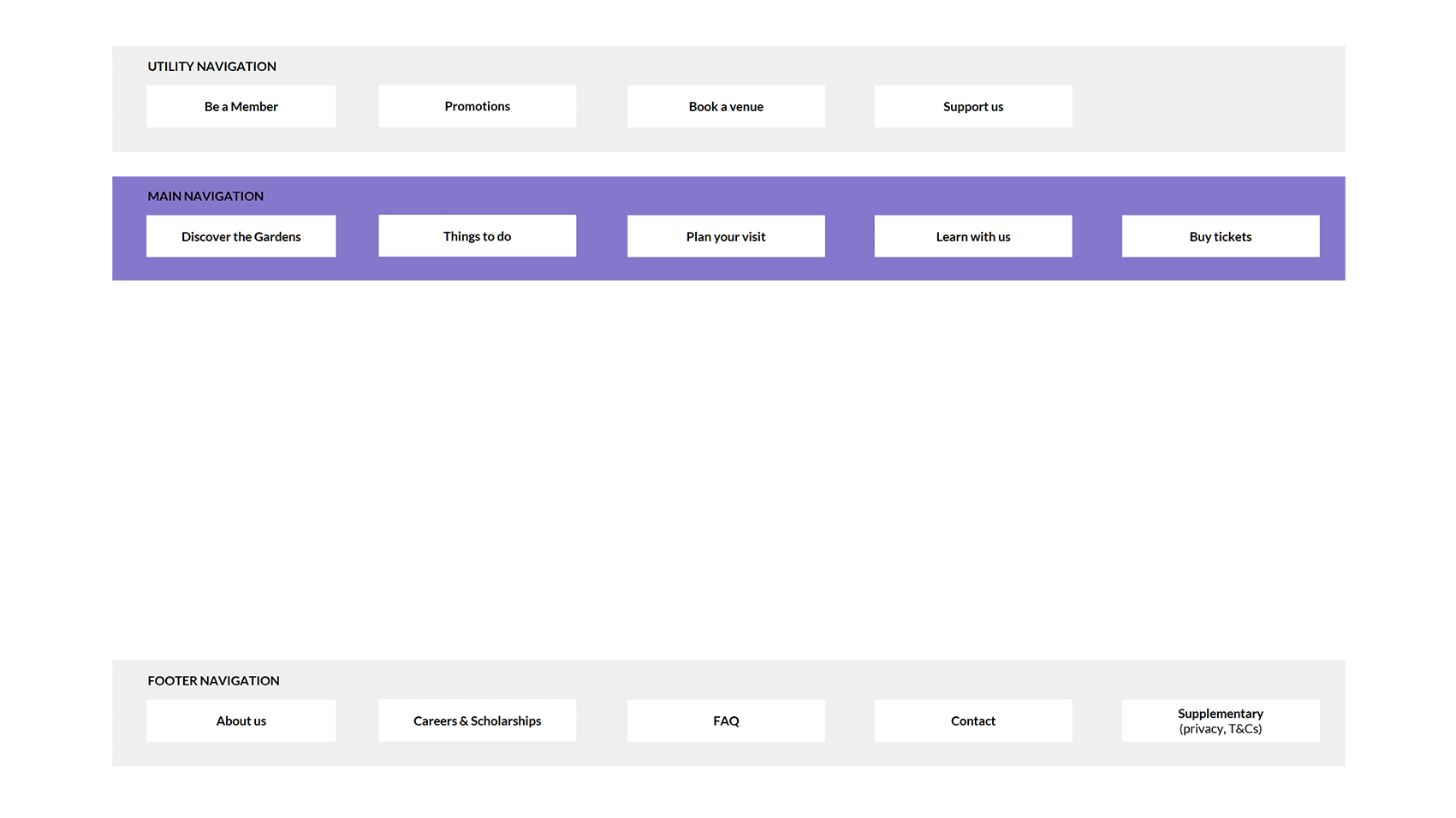
SIMPLIFIED NAVIGATION BAR
Users respond better and faster when they are presented with fewer choices.
-
The simplified Nav bar (in purple) means there’s less for User to ponder over, prompting quicker engagement.
-
The utility nav bar at the top provides clear calls-to-action to common sites.
Together, the two distinct nav bars optimise functionality while keeping navigation clear, focused, and simple.
ORGANISING THE NEW SITE'S IA


IDEATING SOLUTIONS
MOVE FROM M-DOT URLS TO RESPONSIVE SITE
Shockingly, in 2020 Gardens by the Bay was still functioning as a m-dot URL website. Our task was to migrate from the separate mobile URLs to a responsive web design.
Current gardensbythebay.com in 2020

Future gardensbythebay.com

IDENTIFYING USABILITY PROBLEMS


MID FIDELITY WIREFRAMES (MI-FI)
Armed with the new IA and a list of prioritised features, I moved on to wire framing. As clients were not in the stage of co-creation with us, I worked to medium fidelity at their request for easier deliverable approvals. I was building the website by using components to form the new page templates. A little more thought was given to specifics, such as layout and components.
-
Though still black and white, wireframes were in different shades of grey. This was used to communicate the visual prominence of certain elements.
-
Detail given to specific components and differentiating things like buttons and hyperlinks.
-
Varying text weights used to separate headings and body content.
-
Avoiding final images or font styles.


WORKING IN SPRINTS
A design sprint with delivering the screens in batches was put in place by the Project Director and we used Airtable to keep track of the progress.

There were many instances where I needed to mocked up screen flows for clients for them to understand the user's intended movement through the website
GOING THROUGH THE FLOW
MEMBER LOGIN/SIGNUP

BOOK A VENUE


LEARN WITH US
MOBILE WIREFRAMES
After approvals of the wireframes on desktop, I moved onto the mobile view.

THE FINAL DESIGN
By the 2nd sprint, the UI Designer was using my wireframes and coming up with the new design look and feel of the whole website. This is the final design that was approved.
THE DESIGN CONCEPT
-
Bringing the Gardens to the website. So be it on-site or online, visitors can immerse in the same wonderful feeling of escaping into an oasis, away from the urban clutter.
-
To replicate this sensorial ambience, we kept the website’s look-and-feel clean, bright, relaxing. We freed up more pockets of space, infusing the browsing experience with a sense of roaming pleasure.
-
While maintaining a minimalist style all around, we maximise visual drama. Through effects, animation, and design strategies that offer the user an immersive experience.

