Great Eastern Website
The Case Study

THE CHALLENGE


The client had identified five key pages that they wanted to improved on and briefed us to focus on:
WEBSITE OVERALL GOAL
To increase awareness of Great Eastern products and services, by allowing users to find information easily and to drive conversion to our agents and direct online purchases.
WHAT I DID
Together with the UX Director, we wanted to first find out the landscape of the client and the company. Through initial conversations, they had mentioned that being a legacy company they had their fair share of difficulties, but at the same time, the team recognised that it was time for improvements and big changes to their website.
We spoke to five participants from the Regional Teams and three participants from the Marketing Teams. This was done over a period of two weeks.
STAKEHOLDERS INTERVIEWS
WHAT THEY WERE SAYING
"It looks so outdated."

"Can we see more Agents displayed?"

"The terminology is not intuitive."

"The ‘call to action’ is not clear."

"It is hard to navigate throughout."

"The template is very rigid and restrictive."

Each colour represented an individal
ONLINE SURVEY
WHAT EVERYONE ELSE WAS SAYING
To further understand the current situation, we also did an online survey on existing customers and agents. This was to gain their input into key areas of what’s working well and where were they finding difficulties.

Example of survey question
FINDINGS
Customers want to make more informed decisions. Hence, they desire to see more details about the plans (cost, plan specifications) and more tips/articles on choosing the right plan, to help them with their decision-making process.
Agents were more critical of the website and their satisfaction ratings were low.
Both customers and agents felt the website could be more creative. Customers also wanted it to be more interesting while agents would like the layout to improve.
COMPETITIVE REVIEW + UX AUDIT
WHAT'S OUT THERE
In order to learn about the current market, and through close discussions with the client, the main competitors they wanted to learn more about were :


These companies all offer insurance product options and target a similar demographic. In order to find a gap in the market, I conducted a feature comparison analysis:
Feature comparison chart

While all these competitors offered a lot of useful features, I did notice some gaps that we could aim to fill. Overall Great Eastern did not fare well compared to the rest. The call-to-action points were lacking within the website and needed a lot of improvements. With a high drop-off rate identified earlier on, this could be attributed to this 'bad flow'. I can now focus on individual aspects of the page to audit on.
GOING INTO THE DETAILS
An extensive competitor analysis was conducted with organizations directly related to Great Eastern's business model, I audited the information structure, layout, tone, and navigation. The analysis led me to a clearer vision of what were the common features across the existing solutions and what were my competitor's unique values, or what points were also lacking for Great Eastern.
A CLOSER LOOK
IDENTIFYING & ACCESSING
MAKING IT BETTER
Homepage
-
Include more content and highlighting product range on the homepage to give more clarity on what Great Eastern offers as well as improve SEO
-
Refresh UI design to appeal to the younger audience (new to the workforce, young families)
-
Utilize more commonly used terminology such that there’s no guessing required for users
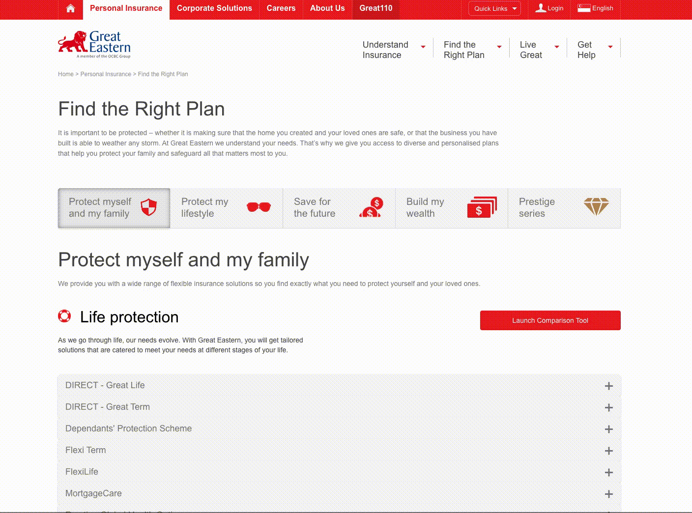
Find the Right Plan
-
Create a need-state filter to help users find the right plan, however, keep this separate from the full listing of the product range
-
Create a full listing of the product range, viewable on the same page
-
Allow visitors capability to get an overview of all the plans (without having to expand all plans)
-
Provide more relevant categories for comparison
Product Details Page
-
Provide product details template with more flexible options for customization
-
Consolidate call to actions on product details page
-
Include more content categories within the product details page
-
Focus on mobile optimization (content as text, not image)
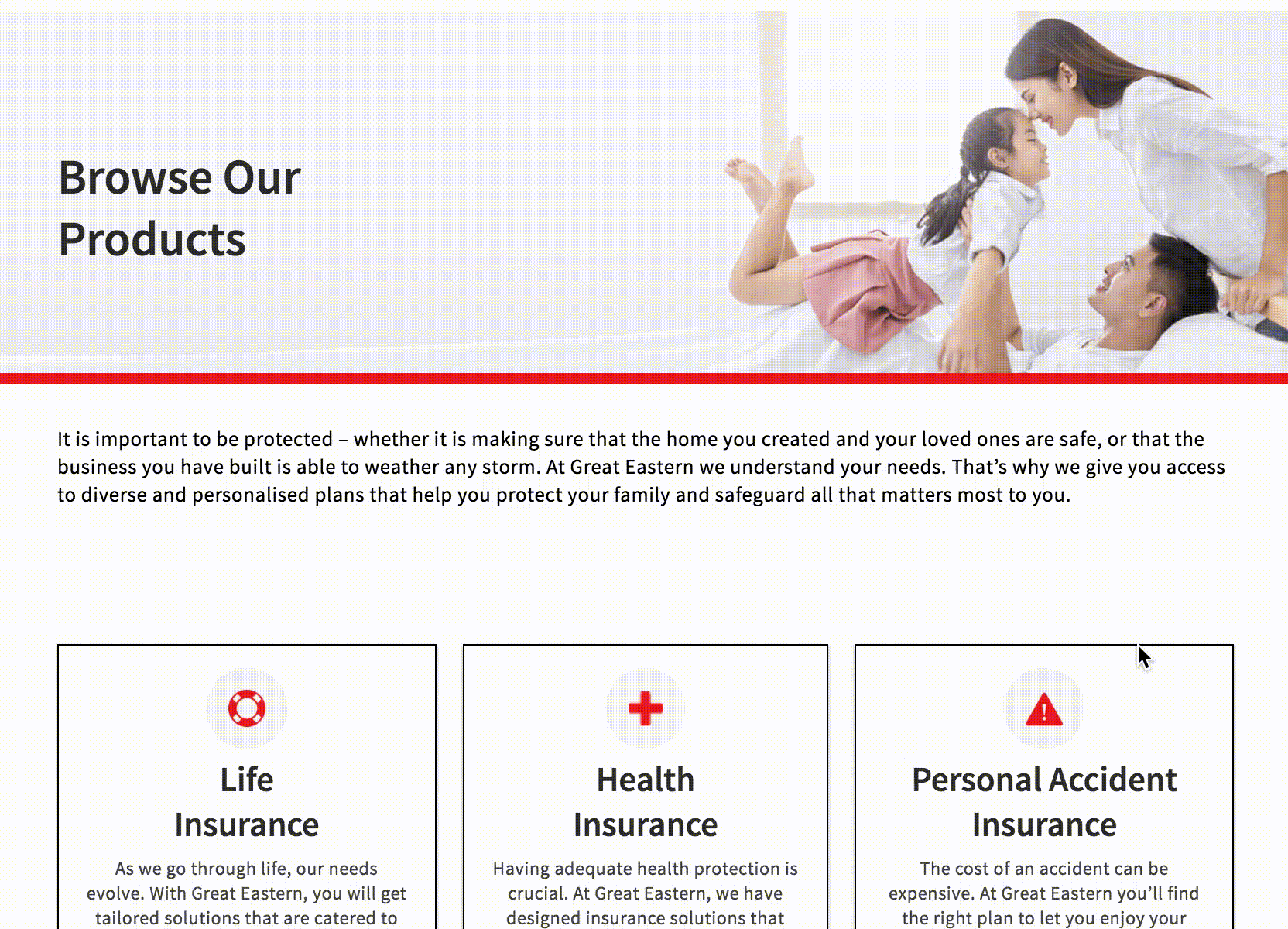
Find a distribution representative
-
Randomise the sequence of representatives shown
-
Utilise a grid with more columns so more representatives can be seen
-
Utilise auto-loading when visitor scrolls to the end of the page

How might we
increase the awareness of Great Eastern products and services?
How might we make findability of information of products more clear?
How might we
allow more flex in the templates for content managers to populate?
How might we make CTA buttons more visible for better engagement and lead generation?
How might we make form application less tedious?
How might we increase views for agents?
"How might we help confused visitors to find out more about our products easily?" "How might we improve Lead Generation by making connecting with Distribution Representatives easier?"

DESIGN ITERATION
At this stage, we had a clear understanding of the problems and how to address them. We implemented and designed all the information we collected. Here are some examples of the design template iterations we went through and presented to the client.
HOMEPAGE
Re-looking at the homepage was a mammoth task but we were excited to tackle it as it would help increase eyeballs on the page. We came up with multiple solutions ranging from a 'build your plan', and displaying information in a clearer manner. We also took upon to improve the design style guides.
Iterations of Homepage

FIND THE RIGHT PRODUCT PAGE
Internally, the client was also going through a 'clean up' of their product offerings (the titles of their products). This made is easier for us to proposes variations of displayed the categories. With that, we also went through an exercise of icon proposals that I came up with, which in the end was provided by the client.
Iterations of Find The Right Product Page
PRODUCT DETAIL PAGE
For this page, we had two sets of users in mind, the Product Managers and the Users themselves. Through the interviews and survey, it was clear that they both were aligned in wanting more content to be shown within the page. We also proposed clearer position of CTA buttons upfront.
Iterations of Product Detail Page
THE DELIVERY
DESIGN BY ALIGNMENT
Right from the start of the project, I was working closely with the Lead UI Designer by sharing the UX audit findings and having daily discussions so that he could layout out the screens and UI elements required to prototype the flows. He consistently checked in after going through the audited deck to make sure that the proposed designs aligned with my recommendations.
These are our agreed-upon deliverables for the optimised templates.
FIND THE RIGHT PRODUCT
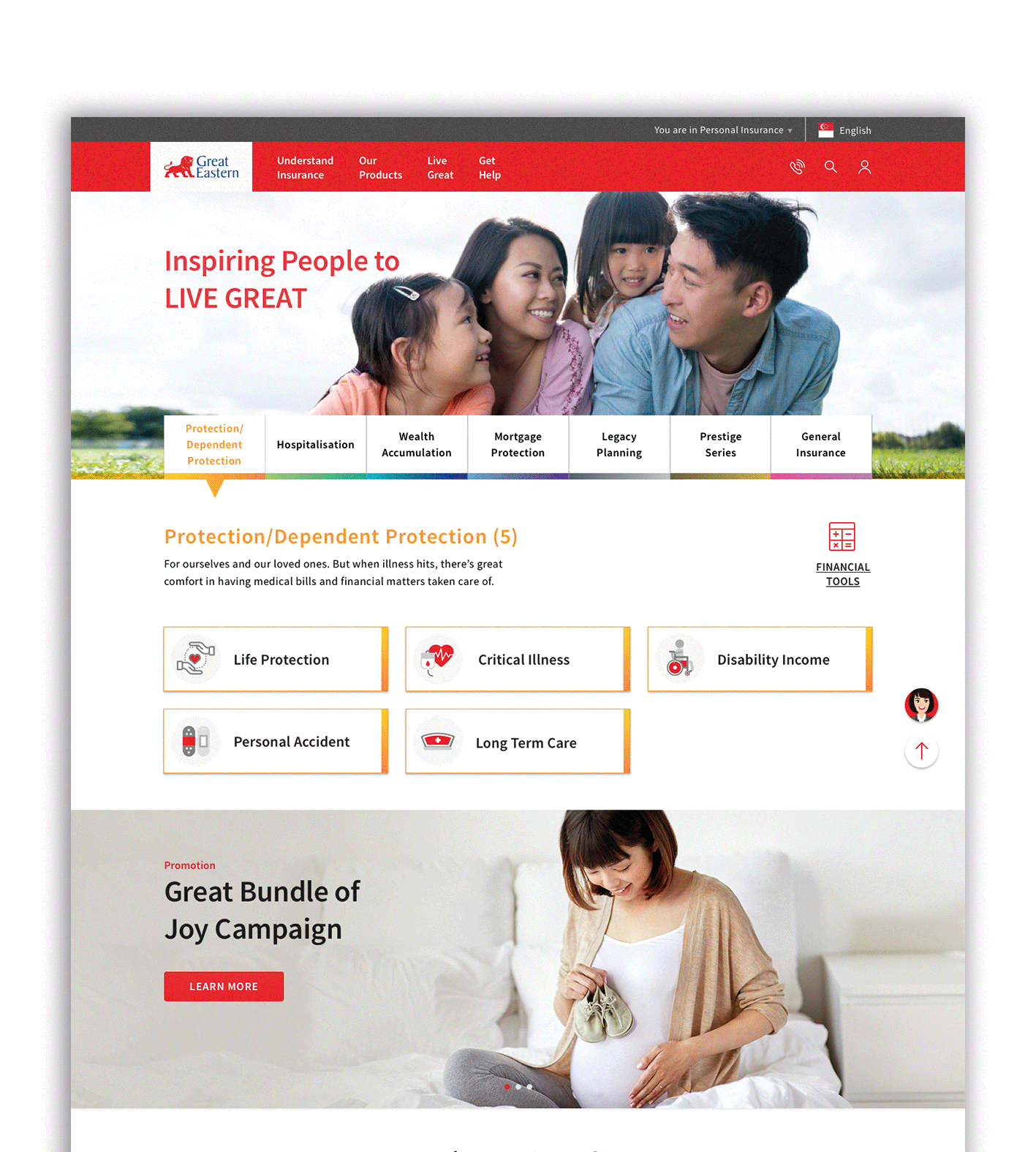
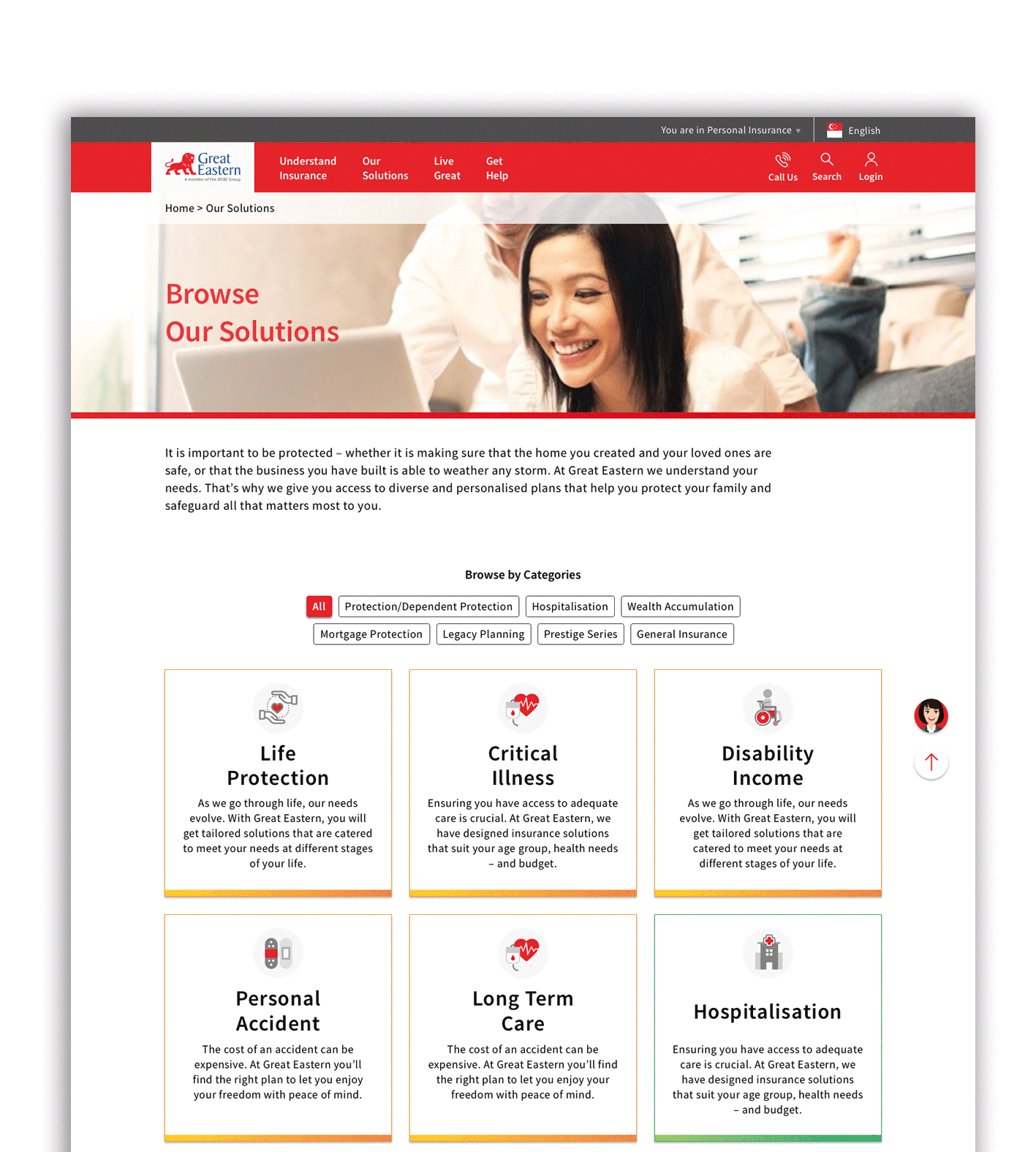
BEFORE
AFTER
IMPROVEMENTS MADE
-
Increased colour contrast and size of text on all pages for better legibility.
-
Full product category listing shown upfront for easier browsing.
-
The naming convention of products have been renamed for clarity
-
Other products to consider implemented at bottom of the page of the product listing page for seamless browsing
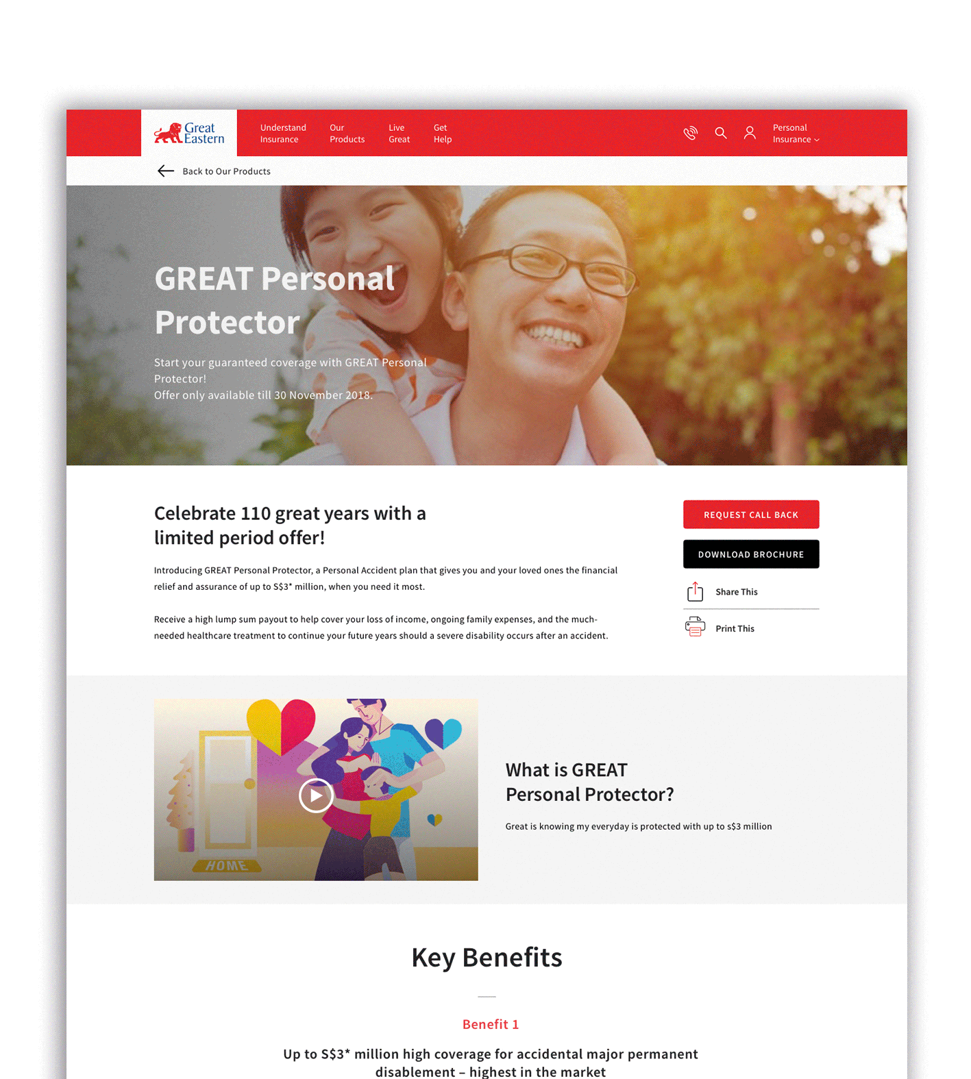
PRODUCT DETAIL PAGE
BEFORE

AFTER

IMPROVEMENTS MADE
-
Increased colour contrast and size of text on all pages for better legibility.
-
Consolidated call to actions and consistently presented at the start and end of the page.
-
Implemented sticky sub-nav for easy accessibility.
-
Provided more contents variety (categories and type) which could help the visitor figure out the products that they need.
-
Collapsed T&C/footer so that is it not so overwhelming to read (with the option to expand should the user need to read more).
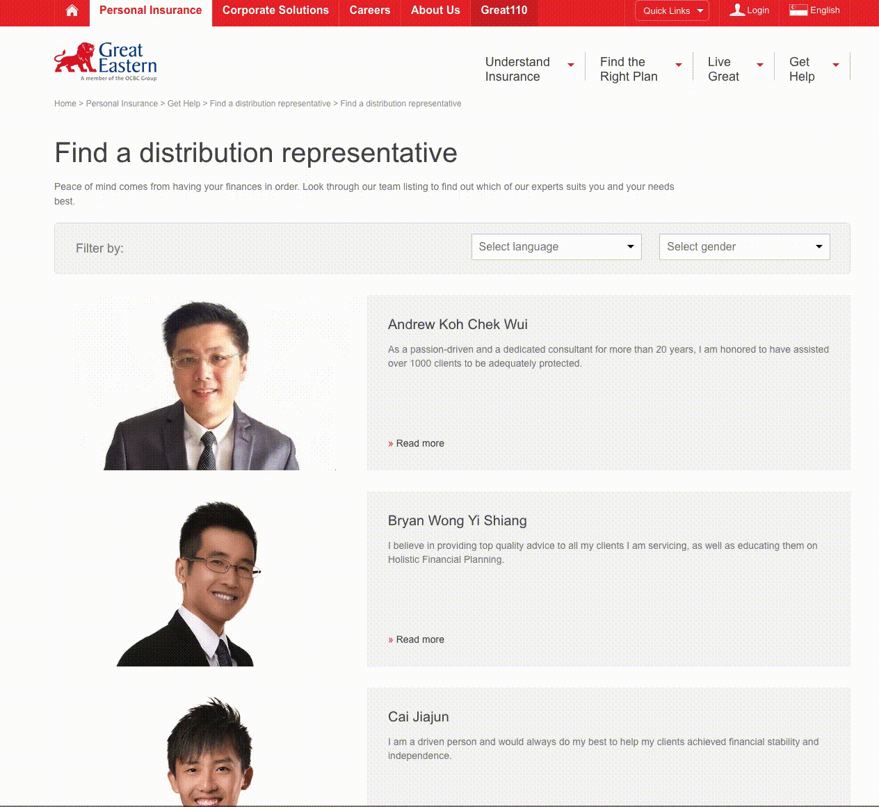
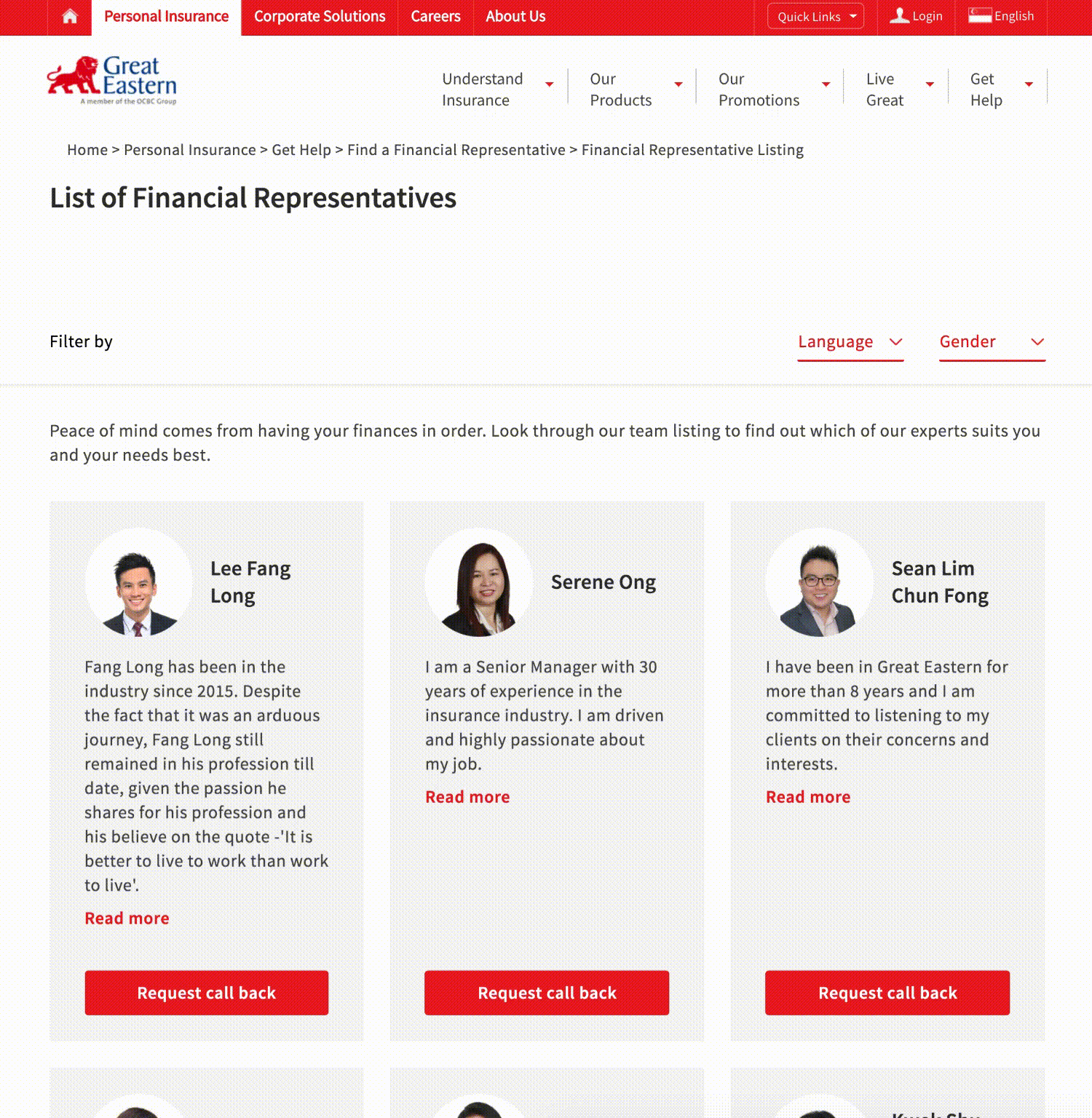
FIND A DISTRIBUTION REPRESENTATIVE
BEFORE
AFTER
IMPROVEMENTS MADE
-
Listing of agents shown in a grid if 3 columns so that the visitor can see more agents.
-
Implemented “Auto loading” when visitors scroll to the end of the page.
-
Implement randomisation of agents so random list is shown every time the page loads.
-
Primary and secondary call to action are clearer for each individual.
REQUEST CALL BACK FORM
BEFORE

AFTER

IMPROVEMENTS MADE
-
The title is shortened to ‘Request Call Back' for more clarity.
-
Only the essential fields featured for users to fill up.
-
Beginning paragraph of ‘terms and condition’ removed and end paragraph of ‘marketing consent’ removed.
THE RESULT
The design and build of modular templates allowed for business flexibility to support multiple types of insurance products. All while providing consistency and clarity for the user to explore their needs and facilitate contact with Distributions Representatives.


